Website mistakes are done by designers
Website mistakes are done by designers
Website Design and development can be a lengthy process and needs very careful attention from designers and developers so that common mistakes can be avoided.
Here is we are going to discuss the process by which we can easily identify the mistakes and fix them before the damage website’s impression and traffic. The website is the face of any organisation or brand. So, be careful when designing and development is in process.
Here are the common mistakes by designers & developers done.
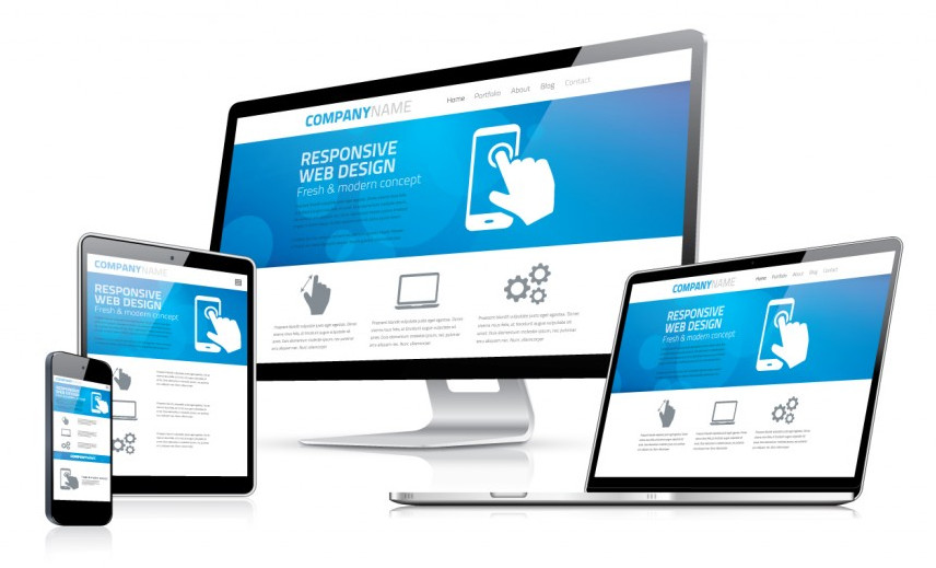
No responsive (device friendly) website
Is your website looks awesome on the computer screen? what about on mobile or on any other screen? These days people are accessing a website from different screens and browsers. So, the Website should be responsive.
Spelling and grammar mistakes
It’s a very common mistake done by developers. Spelling and grammar mistakes are creating a bad impression. If you like a good impression, you will need to proofread your content multiple times.
Forgetting Social Media
If you are not linking to social media like Facebook, Twitter, Instagram, LinkedIn, etc. you are missing an opportunity to connect. Facebook itself has 2.6 billion active users monthly. Don’t let them slip through your hands.
Lack of site map
If your website has difficult navigation then visitor of your website goes irritated. So, Include a sitemap to let visitors access the information they want easily.
Not testing before publishing
We are a human being and these days everyone is in a hurry. So, making stupid mistakes is easy in website code. And those mistakes are can prevent accessibility and not proper design as designed. It’s better to test the website before publishing it to the server and going live. This will help you to find mistakes before going live.
Keyword stuffing
The keyword is everything to get your website in search engines. Tt’s enticing to stuff your page with keyword phrases yet oppose all expenses. Good keywords are valuable and get you to the top ranking in search engines. You know, only 8 percent of viewers are going to click on the second link on the search engines.
Non-adaptive images
Adaptive images will load a different image depending based on client-side adaptation and are effective in cleaning up messy HTML codes. Use adaptive images so that they work well on all devices whether it is mobile or computer.
Flash
Using flash is not a good idea because it will take time to load and these days viewers are accessing our website through different devices. So, avoid using flash especially on splash pages.


